Luma Design System
Luma is a design system template built so any AI tool can read it and ship on-brand UI. A structured brand file at the root tells the AI every rule — token by token, component by component. 56 components, 300+ examples, and a Figma library that stays in sync with the code. Try it on GitHub ↗

The Problem
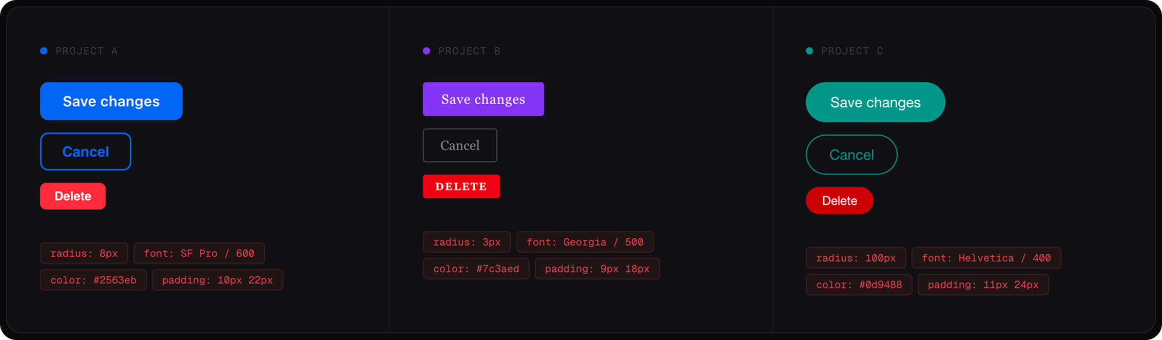
One product, three teams, all building and shipping with AI. Each team used its own tools. Each tool guessed at the brand, because nothing told it what the brand actually was.
The result: every team shipped something that looked fine on its own, but nothing matched across the product. AI was making everyone faster at going in different directions. No tool, no new team member, could ship on-brand UI without a senior designer reviewing it first.
// the problem: same component, three teams, three different versions
The Solution
One design system with a brand file at the root that any AI tool can read. Every colour, spacing rule, type size, and component decision lives in a format machines understand — with plain English notes explaining the reasoning behind each choice.
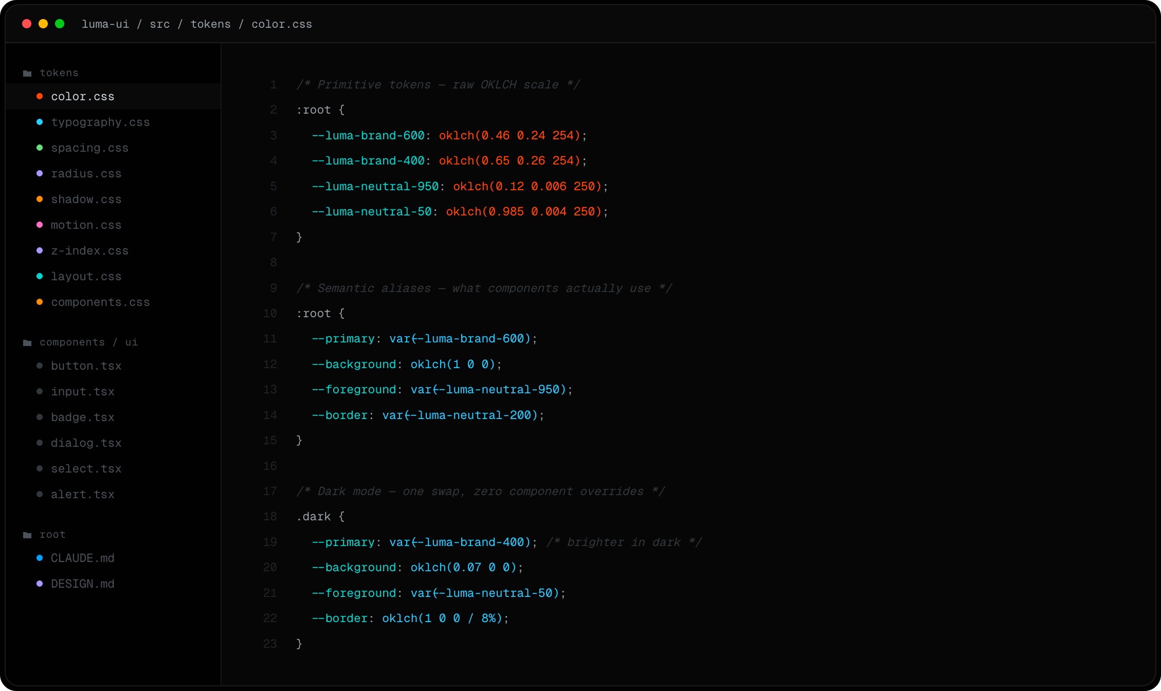
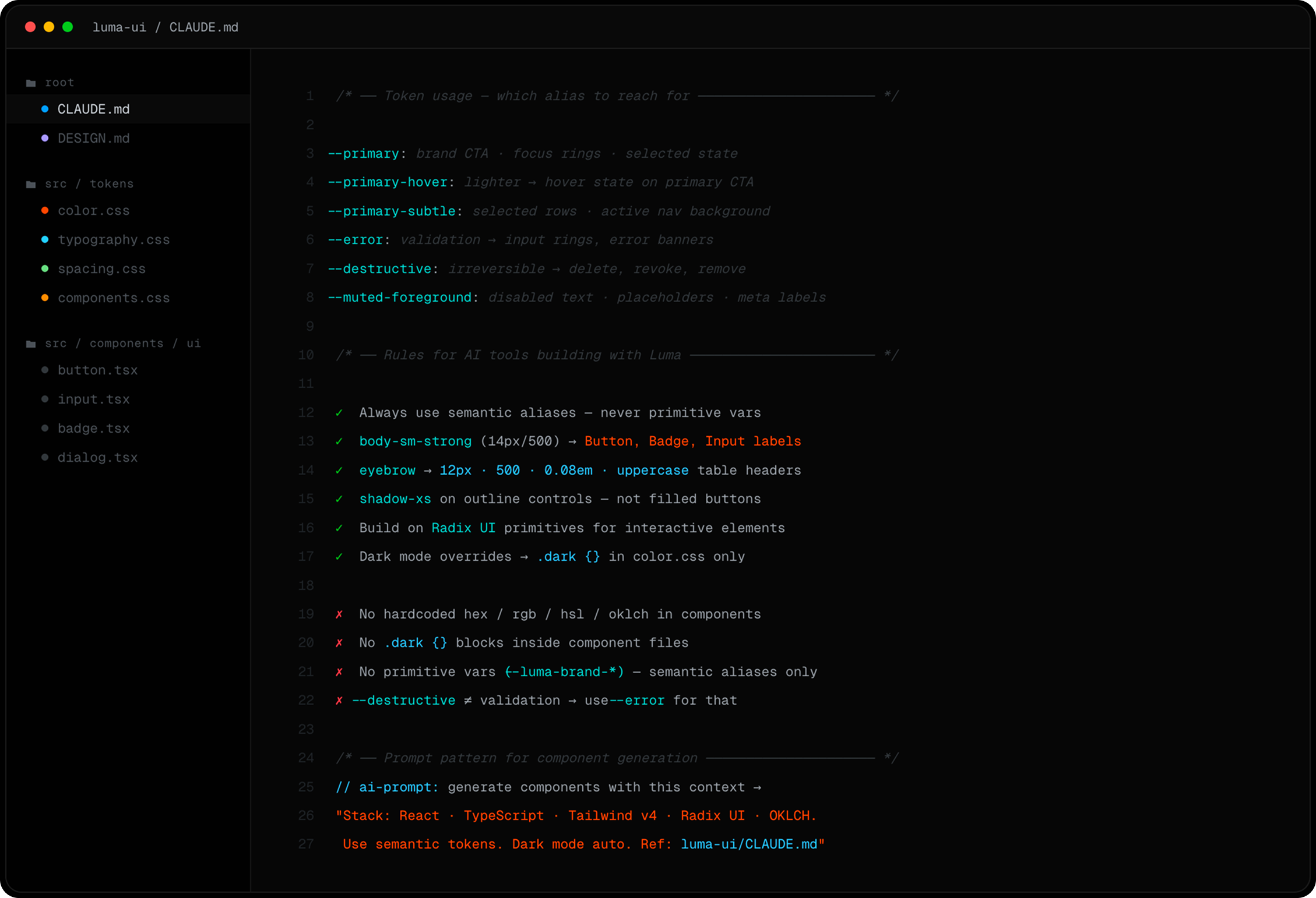
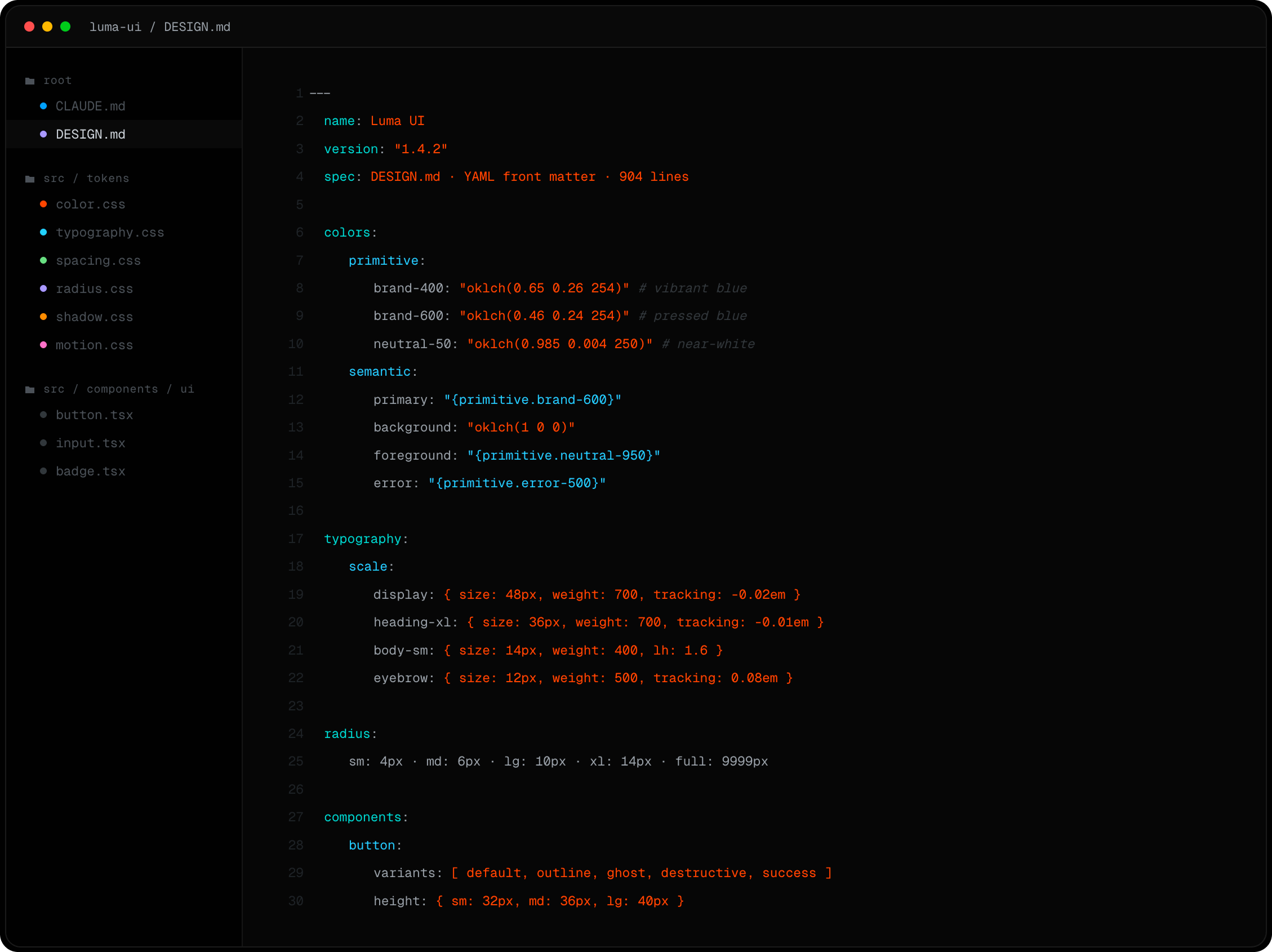
Tokens follow a three-layer architecture: primitives define the raw scales, semantic aliases map them to roles like primary and background, and component tokens give each component its own slots. Change one alias and every component in light and dark mode updates. Dark mode is automatic — no special rules per component. The file follows the DESIGN.md open standard, so it works with Claude Code, Cursor, Stitch, or any other AI tool.
// solution: one brand file at the root that any AI tool can read
Process
Rules first, components second, reasoning written next to both. Every visual decision became a named token in one central place.
DESIGN.md was written in two voices at once — one for AI tools, one for humans. Both get the full picture: what the values are and why they exist. Why a button has no shadow, why error and destructive are two separate tokens for two different situations.
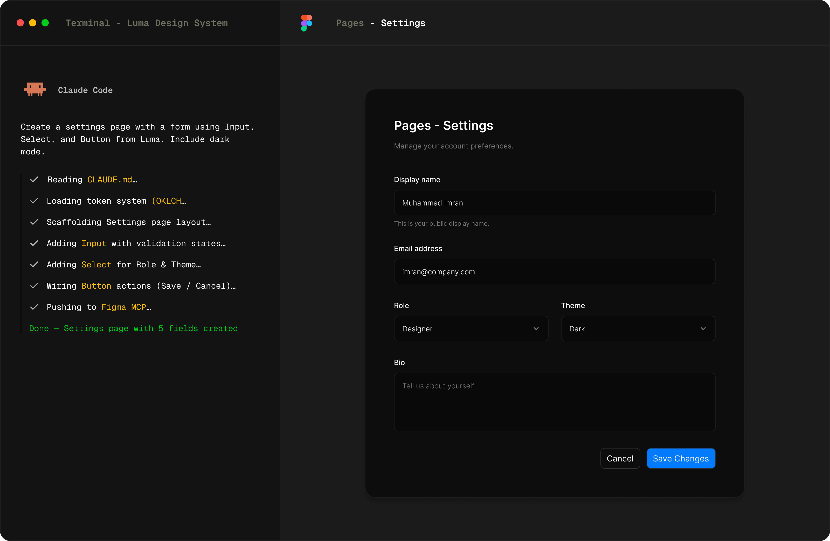
In Figma, designers see the exact component code developers will use. The design and the build stay in sync without anyone having to keep them there.
// process — token infrastructure before any component
// process — CLAUDE.md: machine-readable constitution read by every AI tool
// process — DESIGN.md: 904-line YAML spec — tokens, typography, components as a single source of truth
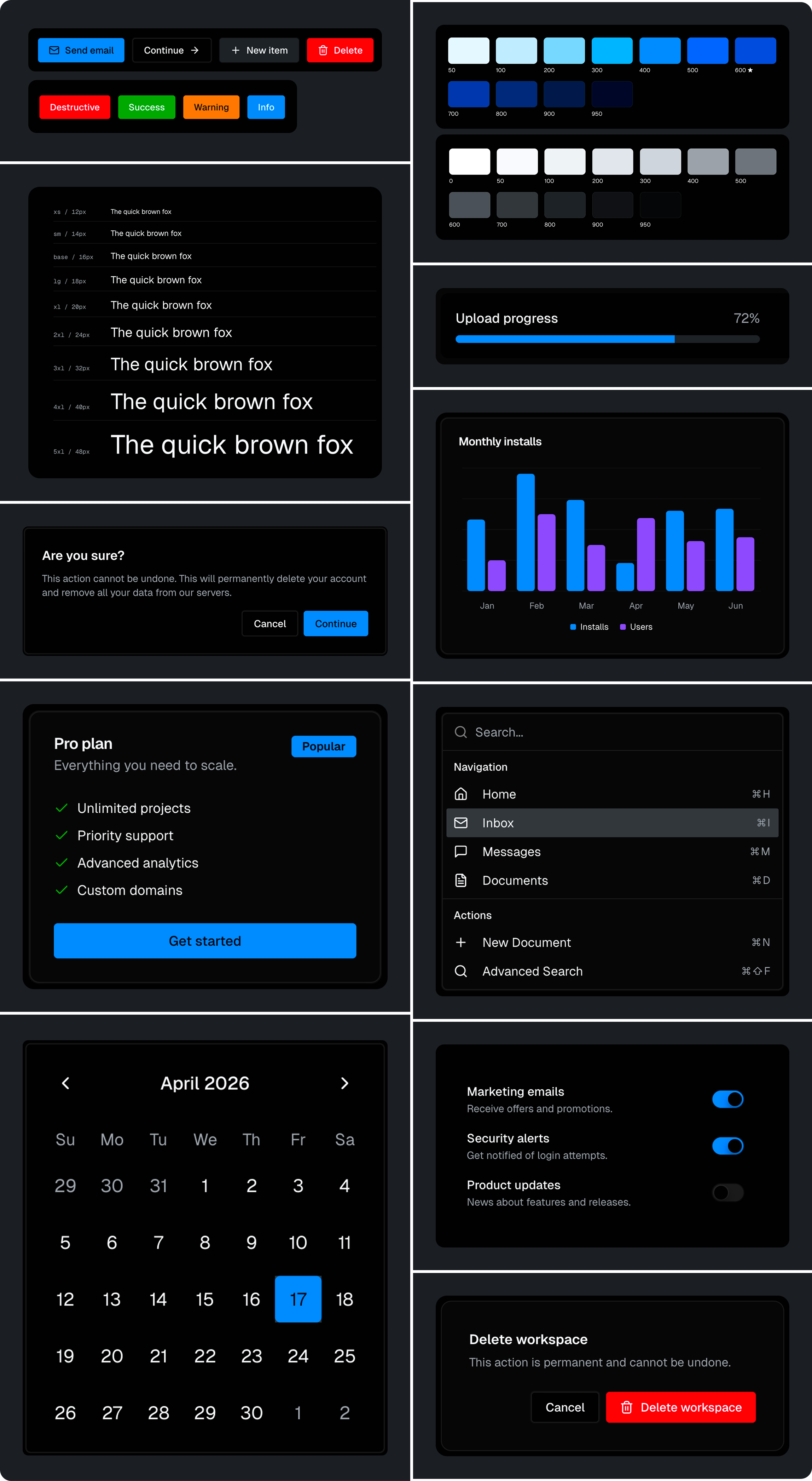
// process: 300+ examples covering every size, state, and variant
Outcome
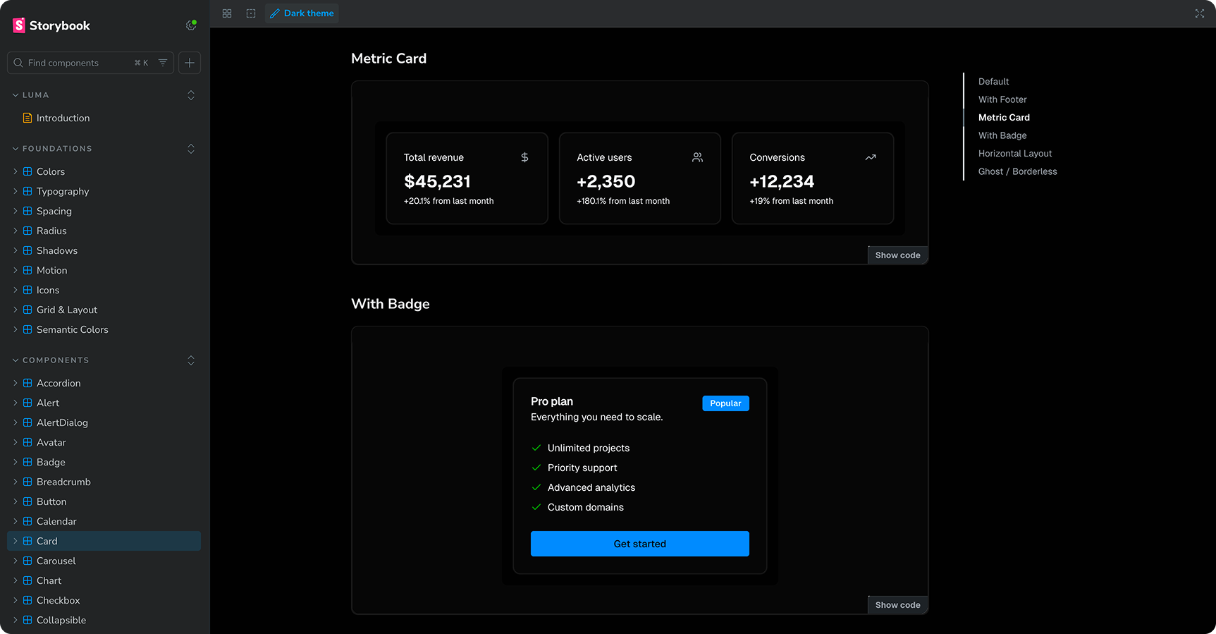
56 components. 300+ examples in the style guide. 1,500+ icons ready to search and use. One place for every visual decision, with nothing hardcoded.
Any AI tool can read the brand file and ship on-brand UI straight away — no briefing, no onboarding doc, no senior designer review needed. Change a colour once and every component in light and dark mode updates with it. One source of truth. No drift.
// outcome: the full component library at a glance